Tempe Gets a Makeover
While modest in budget, the Tempe Library and Historical Museum renovations bring new life to old buildings.


The library planned for a 24-month schedule, but through months of aggressive preconstruction, Okland was able to reduce it to just over a year. The project had to be carefully sequenced so that one area could be cleared of books as another was completed. �It was like a chess match,� Kubricky says. Most heavy construction was shifted to night time to keep noise and dust from disturbing patrons.
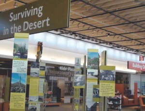
Brightening up the 106,000-sq-ft space was key. �The original building�s design and color palette was rather conservative,� Williams says. �One of our goals was to bring in lots of color, interesting shapes and forms to make it much more creative and appealing. It gives it more of a retail edge since the library is competing with book stores and coffee shops for people�s attention.�
For example, unique cactus-shaped sitting areas and numerous colorful accents on unusually shaped walls are being incorporated in the children�s library on the lower level. Throughout the entire project, crews will use 27 different paint colors and 20 different carpet colors, says Okland project manager Erik Dunn.
In an unusual move, Tempe chose to have the contractor perform FF&E. �A function of economics right now, the general contractors seem to have some leverage out there with the FF&E vendors and are able to come back with a slightly better pricing than we would get through existing state contracts,� Balck says.
At certain trigger points during the phased construction, Okland releases contingency funds for the library�s long wish list.
Unlike the library, the museum�s refresh involved 3,000 sq ft of new construction along with 12,000 sq ft of renovation to help make the museum more open and visible to the public.
�We want people to be able to look in and see what�s going on,� says Amy Douglass, museum administrator. �Before it was just a blank � you didn�t know what the heck the building was.�
A new entryway features an aluminum and 21-ft-high glass storefront with largescale graphics to entice passersby. LED lighting on the new fa�ade is programmed to change colors and create a more lively presence in the community, says architect Philip Weddle, AIA, with Scottsdale-based WEDDLE GILMORE black rock studio.
Crews with Phoenix-based general contractor Brignall Construction demolished the concrete and brick entry and used steel beams to span the space, creating a bright and open lobby. A new double-height community room is front and center.
The museum was closed to the public during construction, but �the museum staff was still occupying the building, so we tried to keep the temperature, dust and noise down during the demo,� says Brignall project manager Chance Severns. About 718 lbs of debris was removed, with 91% recycled.
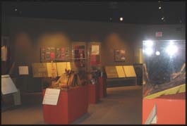
Gallery space saw a dramatic change.
�It was more of a dark cave before, and now it�s more open and airy,� Balck says. �They use the vertical space whereas be- fore they really tried to hide it.�
The rectangular gallery features a high ceiling with 50 small windows near the ceiling running down both long ends. When the building was converted to the museum in 1991, the windows were blocked off.
�The philosophy at that time was no natural light in museums,� Douglass says. When they were uncovered, the original stained glass windows were removed and turned over to the museum for future use, and they were replaced with clear glass, Severns says. A fabric scrim acts as a curtain to reduce UV rays and eliminate hot spots.
�Enhancing the visitor experience was a primary goal and natural daylighting plays a major role aff ecting how people feel,� Weddle says.
Bryan Parker, Brignall�s project superintendent, says the ceiling also needed cleaning up. The new design called for repainting it with a lighter color.
�It had a lot of conduit and ductwork that we had to take out,� Parker says. That meant creatively hiding some of the replacement ductwork in plain sight, inside the soffi t below the bank of windows. �There�s no actual ductwork in there � the entire 2- by 2-ft channel is the duct itself,� Parker adds.
Construction completed in December, and crews are almost done assembling the exhibits, which are modular and interchangeable to give curators maximum flexibility. �We aren�t stuck with one look like the way it was before,� Douglass says.
Sustainable materials such as Lyptus wood, wheatboard and bamboo were used throughout. Displays are interactive and utilize various technologies, with multiple exhibits geared specifically for children.


